C’mon, Google. You can do better.

I’m an Android nut, no question about it.

I have three Android phones sitting on my desk, three Android tablets floating around the house, and even a Cr-48 Chromebook. I’ve embraced the Google ecosystem, and nearly all of my digital data–from music to contacts to files to photos–resides on Google servers.
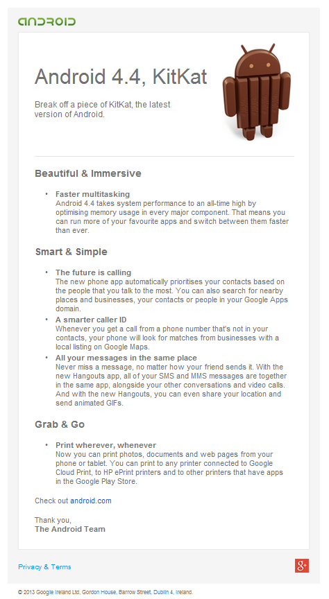
AndroidEmailAs a marketer, however, I take a critical eye to how Google articulates and presents their solutions. As Android has evolved over the years, I’ve also evolved from utter frustration to iOS envy to a feeling of superiority over all other mobile operating system users. And, as Google hired more designers and non-technical product and marketing staff, it was visibly evident in their products and their marketing materials. Android morphed from a collection of disjointed features to a cohesive and connected OS with a single and pervasive design theme.

Google’s apps also started to look more and more similar, giving users a common set of metaphors and visual reinforcement that all of Google’s myriad apps and services were, in fact, being built by the same company.

Then, I get an email…

As backstory, there have been many rumors about Google’s upcoming Android upgrade. I’ve been rabidly consuming any and all speculation over the past few weeks related to Android 4.4, as well as their poorly-hidden Nexus 5 phone.

What I didn’t expect–given how Google has really upped their marketing game–was the weak, ineffectual, and uninspired Android 4.4 launch announcement I discovered in my inbox this morning.

Sigh.

Take a look for yourself. It’s as if it were sent from 1998, via AOL, over a dial-up connection. What are my nits? Here we go:

  1. First impressions count, and this email is boring, drab and, dare I say, ugly. White, black, and, ugh, brown? Sure, there’s a tiny bit of green in the header, but, c’mon, you can’t look at this email and feel anything. I’ll bet anything that it was designed by someone with an engineering degree.
  2. It is all text, which is boring and un-engaging. Sure, Android developers like details, but it’s boring and gives me no real reason to want to read it. Visually, it’s a “wall of text,” as a former executive I worked for once said as he berated a presenting product manager and, turning to the remaining presenters, screamed, “If I see another wall of text, your presentation is over.” (It was then comical to see a dozen product managers flip open their laptops and scramble to edit their presentations, but only because I wasn’t presenting that day.)
  3. It wasn’t sent to just developers, so why does it look like it’s for engineers? According to the footer, I received this email because I “previously opted in to receiving emails with product updates, new features, newsletters, special offers and market research related to Android.” That means that average people (i.e. consumers) are getting this email.
  4. It’s too detailed. Sure, people want details, but that’s what websites are for. This email tries to straddle the line between giving a lot of info and teasing enough to get readers to click through. But the textual nature of it causes it to look long. And boring.
  5. The call to action is at the end. And below the fold. And barely apparent.
  6. The call to action only appears once. Nothing else in the body of this email–not the Android logo, not the KitKat, not the individual bullet headings–is linked. When you finally do go to Android.com, you see a modern, responsive, interactive page. Why couldn’t the “smarter caller ID” header link directly to that content on the website? That’s not hard to do, especially when you have thousands of smart engineers in your company.
  7. Why no imagery? The website features great photos of the new OS’s features, but why didn’t they use any in the email? And if they decided to use one and only one image, why use the KitKat? That conveys nothing to the reader about the email’s content, especially if they are not already familiar with Google’s OS version nicknames.

Rant, over.

My Month with Miui

I’ve had my beloved HTC Nexus One for about 18 months now.  When it comes to tech hardware, for me, that’s about 12 months longer than usual.  In fact, I was just reading about the new Kindle Fire and, as my gadget lust consumed me, I started to wonder if I have some sort of personality trait similar to drug addiction.  I have a Windows 7 laptop, an Ubuntu laptop, two Android phones, an iPhone 3G, an iPod Touch, an iPod Mini, a Google Cr-48 chromebook, and an HP TouchPad – not to mention the wife’s Kindle and iPad – and I still want the Kindle Fire! What’s up with that?

Windshield wipers on your HTC Sense phone!
Windshield wipers on an HTC Sense phone!

But I digress…

Back to the Nexus One. Over the past year and a half, I’ve gotten incredibly excited at every OS release, updating to Android 2.2 via OTA just to see how that worked, then manually updating to stock 2.3 to get the new UI. With each successive OS release, it’s the little things – whether with Android or iOS or Ubuntu or Windows – that get my curiosity going.  More than the speed or power increases, I’m interested in the “look” and the new functionality. What’s going to change the look? Is the font different? How are the icons designed? What are the sounds? Can I change the color of the blinking trackball light to correspond to different types of alerts? How cool is that animation that flashes the display to sleep like an old TV set?

Yes, I am a geek.

However, since Gingerbread/2.3 dropped in December, 2010, and other than some minor releases, it’s been a long dry spell for Android (phone) updates. What’s a geek to do? Sure, I’ve installed apps and themes that give me the look of HTC’s Sense, but that’s just in a few areas – like the awesomely cool flip-style digital clock and killer weather animations (oh yeah, the raindrops and windshield wipers are my fav, for sure!).  And, I changed my wallpaper pretty much weekly, going from Android’s cool “live wallpaper” to some of my own photos of local scenes to this awesome statue when I was on a bokeh kick. But those tweaks only satisfied me for so long.

The Unlock

I’ve always considered unlocking my phone, but never really wanted to devote the time to figure it out. The main driver was to try CyanogenMod, which is essentially a custom version of Android developed purely out of joy by a ‘Burgh dude, Cyanogen, and his community of developers. But I was always afraid of breaking something, bricking my phone, losing all of my data, or somehow making a mistake. Then, in a fit of boredom about a month ago, I took the plunge and, after about 20 minutes, had an unlocked Nexus One! It was an incredibly simple process and I can’t believe I didn’t do it sooner.

Miui Screens
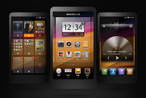
Miui's refreshingly fresh look

With the phone unlocked, I now had the opportunity to “flash a custom ROM” onto the phone. CyanogenMod was the obvious choice, but I had been reading more and more about a Chinese company, Xiaomi, and their custom Android ROM, Miui. CyanogenMod looks very similar to stock Android and the team puts most of their effort into features and power, but Miui has taken a different approach and reskinned the entire UI. There’s very little in common with Android or even Sense. Sure, it’s the same 4×4 icon layout with a top notification bar and bottom button tray (same as every smartphone), but the “look” is entirely unique. All of the system-type apps, like the music player and text messaging, are new. Even better, Miui has fantastic support for themes, and better yet, you can cherry pick only the parts of themes that you like to create your own, totally custom theme. How cool is that?

The Flash

If the unlocking process was easy, the installation of Miui was just as painless. It took a few minutes and a couple of restarts and that was it. In my hands I held what was essentially an entirely new phone! Awesome! Of course, the downside was that, in my hands, I held an entirely new phone. I had to re-install all of my apps and reconnect with all of my social media services, but the process was pretty simple. In just 90 minutes or so, I was downright giddy! Over the next few days, I’m sure the wife became sick of watching me constantly play with my phone and, every few minutes, blurt out something like, “Oh cool! You gotta check this out!” She’s a good sport.

Some of the best improvements over stock Android are the capabilities of the Nexus One that Miui engages but that Android inexplicably ignores. It’s confusing especially since the “Nexus” phones are supposed to showcase all that Android can do. The FM radio is one example; it’s not accessible via Android at all. Multitouch is another. Why Google wouldn’t enable these features is beyond me, unless it has something to do with IP and lawsuits?

The Verdict

I’ll make it simple: Miui is awesome! I could go on for days on some of the best features, but here are a few of the key things that make it better than Android (and I won’t even compare it to iOS, which barely allows any user customizations at this level). It’s incredible to think of the amount of development that went into Miui, and that it’s FREE!

  • Unlock Screen:  Miui allows you to unlock directly into the dialer or messaging. The developers looked at the typically static unlock screen and asked themselves, “Why do people usually open their phones?” Obviously, it’s when they get an alert or they want to make a call. The unlock screen has three icons, a phone, lock, and message balloon. If you swipe on the phone icon, the phone unlocks into the dialer. It gets better by putting a number indicator to tell you how many unread texts or missed calls you have. Even better, if you press and hold on the message icon, it pops up the last few unread messages with no need to even unlock your phone! That’s amazingly helpful! If you’re listening to music, the unlock screen adds fwd/back and play/pause buttons so that you can quickly manage music without diving into your phone. This is invaluable when I’m running and listening to music on my phone.

    Miui's Unlock Screen
    Miui's unlock screen, showing the music controls (and graphics) plus the direct-to-app phone and message icons
  • Camera:  Miui speeds up the camera app’s opening so that you can take photos almost instantly. Then, they add dozens of new settings that Android ignores, like burst mode, effects, anti-shake, metering modes, and many more. You can even focus on specific areas of the image just by tapping that area. It also adds 720p video recording, for your high-def, memory-eating delight.
  • Toggles:  Stock Android offers a neat widget to toggle wifi, gps, sync, and brightness. Miui, again, goes much farther by putting 12 toggles into the swipe-down notification menu, making it accessible from any screen (unlike a widget, which lives on an individual screen). The “reboot” is an interesting toggle, and they even give you options for the type of reboot you wish to perform. Geeky, and I’ve never had to reboot my phone, but neat nonetheless.
  • Guest Mode:  An awesome feature that hides calls and texts and prevents apps from being deleted. Sure, it’s useful if you’re going to let someone else use your phone, but it’s killer for parents who want to let their kids play with their phones.
  • Themes:  I mentioned them earlier, but Miui themes are incredibly comprehensive and powerful, changing everything from fonts and sounds to icons and icon shapes, the look of the messaging interface, and the number of apps in the app tray. It’s incredible how they’ve implemented this to the point of essentially allowing anyone to create a theme and almost call it their own ROM. It’s that powerful.
  • Torch:  The Torch has to be the coolest app on Miui. I’m not sure if something similar is available elsewhere or in a downloadable app, but it’s brilliant! What does it do? From the lock screen, if you hold down the home key, your camera flash illuminates as a flashlight! It’s awesome for walking up dark stairs, finding your keys (or the keyhole), or not tripping and killing yourself in the dark.
  • Additional Fluff:  Pinching on any screen pops up a thumbnail of all screens, allowing you to quickly navigate to the desired screen or add new screens. App folders can create collections of apps within one button (yes, iOS has had this feature for a while…). There are eight screen transition options (when you’re swiping between screens), from 3D cube to rotate to page. You can add apps on up to 11 (maybe more?) screens, while Android limits it to 5. FTP, which allows you to copy files to/from your phone over wifi. The dialer shows a keypad plus the past four calls to quickly dial a recent caller. The battery icon can be made to show the exact percentage remaining, not just a simple, partially-empty icon. You can control, app by app, which can transfer data over wireless, wifi, or both, letting you specify, for example, that email can sync on wifi and wireless, but Netflix can only use wifi to save yourself from using all of your monthly data.

Bottom Line

I’m sure I’m forgetting a few things, but I think you get the drift. If you have an Android phone and want more control and a fresh UI, definitely give Miui a look. You’ll unlock your phone’s full potential and give yourself the chance to truly customize every aspect of your phone and make it your own. Honestly, it’s saved me a few hundred bucks from upgrading to an entirely new device. Sure, I’d love to have a bigger screen, and the N1’s “champagne” color is really cramping my style, but even in today’s lightning fast mobile phone world, my 18-month-old device is holding its own!

Get on it! I waited way too long, and now I’m looking forward to the day that I get tired of Miui (a few months, probably) and can give CyanogenMod a try. I’m sure the wife is excited for that as well…


Screw the VCs, I Know JQuery!

When I first set out to start my own app business, I figured it would require a few basic things:  a business plan, developers, an alpha version, and then lots of angel and/or VC money to make it all come together.  But, this week has really made me realize that I was very wrong.  Let’s take a look the “why” for each area.

  1. Biz plan:  In my years in the Bay Area, I’ve come to be highly suspect of any business plan, especially the revenue projections.  Moving to Hawaii and working with some non-Bay Area companies has only reinforced my belief that business plans are akin to resumes for businesses: slightly inflated at best, outright lies and fabrications at worst.  Business plan financials are notoriously inflated, because unless they show a billion-dollar market opportunity, they are worthless to VCs.  So, every business plan creator then fabricates that billion-dollar opportunity out of thin air (and Gartner reports).  It’s one of the many dirty little secrets of startups: everyone knows that it’s a lie, but everyone just goes along with it.  (In place of a biz plan, I created a simple, three-page “concept document” to pass around for feedback.)

    Swimming In The iPool (cc JD Hancock)
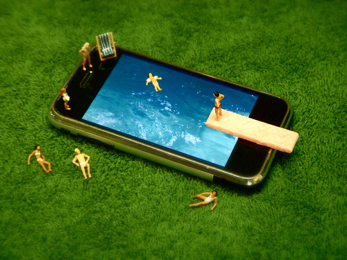
    Swimming In The iPool (cc JD Hancock)
  2. Developers:  I wish that I could code.  I wish that I could create some whiz-bang app that used your GPS coordinates to tell you the optimal inflation for your mountain bike tires, or could use a photo from my phone to tell me if that slice of bread is bad before I make toast with it.  I wish that I could take all of my ideas for the next killer app and make it a reality that same evening.  Sadly, I’m limited to Google’s App Inventor (yes, I’ve already created my very own “whack-a-mole” app), WordPress (you’re looking at it right now – and you’ll see a different version if you visit this page with your mobile phone), and have just been introduced to Jquery Mobile.  What does that mean?  Well, the combination of these three (plus others, like Mobile Roadie and this list), make it easy for anyone with some basic knowledge of code to create at least a nice alpha version of any mobile app and at best a fully functional product.
  3. Alpha Version:  Ah, the all-important alpha version: creationism.  Sure, it might not actually process credit card payments or use the stars for navigation, but it will give you the ability to give a great demo and introduce your app concept to friends, partners, and potential users/customers.  Using Jquery, it took me about one day to create my first mobile web app – mostly functional!  I made a “Call Now” button fire off the phone’s dialer.  I used coordinates to create a “Map It” button that opens Google Maps’ navigation tool.  And, it all looks pretty darn nice, if I must say.  That’s amazing, and significantly delayed my need to pay real money to real developers.  Sure, I’ll need great developers very soon, but it’s amazing what can be accomplished easily and free these days.
  4. VC mondy:  How much have I spent so far?  Well, not counting my own time and Starbucks purchases, I’ve pretty much spent zero dollars and have a “real” version of my concept app that I can show to everyone.  It doesn’t cover the full breadth of my concept, but it gets the point across and does it much better than me saying, over and over, “Imagine if you had this on your mobile phone…”  Now, I can show them what I mean, and get exponentially more valuable feedback, ideas, and direction.

So, why do I even need VC money?  Last fall, I watched this video by Jason Fried.  One of his points that resonated with me was around taking outside investment:  once you take that money, you’re focused on spending it, not on actually making money.  It was a great point, and I’ve seen that happen countless times in Bay Area startups.  Get $X million, spend it like you’re already making millions in revenue, then scramble for your next round of funding when you realize that you aren’t pulling in the revenue for which you set expectations in your business plan (see #1 above).  I also recently met with a friend who has had success in numerous startups, large and small.  When I mentioned looking for some angel funding, he was almost offended.  Why would I want that false sense of security, he asked.  Why would I plow money into development, or marketing, that wouldn’t be sustainable after the money ran out?  Why would I take seed money at a fictitious valuation, which then requires a valuation increase for Series A, which then requires an inflated valuation for Series B, and so on?  Why would I want to dilute my potential?  (Of course, I can see many reasons to actually take outside investment, like the expertise provided by the advisors, to enter new markets, or to expand a proven model.)

Bottom Line

In the few short weeks that I’ve been at this, I’ve talked with a bunch of developers (CA, HI, Mexico, and India), a few VCs, and a ton of friends and colleagues.  While 100% of the feedback has been valuable, only about half of it has been positive.  In most cases, I tend to agree when they point out flaws, challenges, and competing products.  It helps me to hone my pitch and focus my concept.  It makes me better at what I’m doing, gives me a thousand more ideas, and helps me to really figure out how to make this work.

Yeah, I’ll probably need VC money to make this work.  But, I’ll never get tired of reading the stories about successful entrepreneurs recounting the dozens and dozens of people who told them, “That’ll never work.”  On the VC side, I just hope I don’t have to plow through 298 more rejections before I reach the level of Pandora…

Channeling the Positive…

So often, I tend to get very negative when it comes to marketing or business ideas.  I’m sure my DW can attest to my most-used comment (“outburst” is probably a better word…) while reading VentureBeat is, “Oh my god! Listen to this stupid idea that just got millions in VC funding!”  I’m not sure if it’s age, cynicism, or just being around a critical mass of coworkers over my lifetime to really, finally be able to quickly separate the smart from the, well, not so smart.

Example:  While reading about Bump.com, the license-plate social media startup that links people via their car’s license plate numbers and has just raised $1M, I jumped to the conclusion that it was, yet again, another reason that the Silicon Valley bubble was about to burst.  Instead, I should have focused on the positives:

Great Startup Ideas
By cswtwo (via Flickr, Creative Commons)
  • VC and angel money is fairly easy to get.
  • A startup’s focus is usually very different after a year.
  • Getting an early jump on connecting your car to your social graph is an ingenious idea.
  • This is a great experiment to test the bounds of social media.
  • I now have an outlet beyond my middle finger and my horn for the jerk-store in front of me who jammed on his breaks and didn’t use his turn signal.

With less than two weeks focused on my own startup, I’ve quickly realized that there is as much negative energy in the business world as there is positive.  And, being pretty much a solo operation, it’s up to me alone (and maybe Buddha) to ease my suffering.  My negative energy hasn’t been because these other startup ideas have been that bad (OK, some have been that bad…), it’s been due to my jealousy and anger at myself for not having the confidence and positivity to launch something on my own.

Bottom Line

Now, when my startup launches, I can’t wait for all of the other people to say, “Yeesh, what a stupid idea!”  It’s already happening, and, after a momentary, “oh no, they might be right,” I quickly plow forward, knowing that this is a great idea!  And, to all of those other companies getting seed or VC funding, I say, “Good for you! (But leave some for me!)”

On My Own: Starting Something Big

Well, today is my first day as a full-time employee of my own company!  Sure, I have no salary, no funding, no infrastructure, no office, and am incredibly anxious, but at least I’m doing it!

It’s been something I’ve wanted to do for years, and finally, I’m going all in.  This past Friday was my last day at my previous (and hopefully final) consulting gig, and now the only boss is ME – and my wife… 😉

GapingVoid.com
Cartoon by Hugh (c) gapingvoid.com

With companies like Groupon, LivingSocial, Gilt Groupe, Zynga and others raising hundreds of millions of dollars at valuations in the billions of dollars, I became increasingly inspired.  With copycat companies and silly ideas like a license-plate social network raising millions, I became increasingly frustrated: If these marginal ideas can get off the ground, just think of how a GREAT idea would do!

So, after MUCH encouragement and prodding from my lovely, supportive wife, a lot of “that’s a great idea” from friends, and sideline co-founder support from buddy, I’m going all-in and starting my own business! Today, Monday, March 7, 2011, is day one!

I’d love to tell you all about right here, but I’ve always been jealous of the secrecy surrounding those so-called “stealth” start-ups.  (I mean, really, why can’t I know?  Why am I not allowed in your group?  Is this junior high?)  So, for a little while, it’ll be stealth – at least until we find a name for it…

Know When It's Time To Leave
Know When It's Time To Leave (c) odeisel

What I can tell you is that it’s going to be an app-based business – and let me coin that phrase right here, right now.  It’s like an online or e-commerce business, but the “online” component will be replaced by mobile apps.  So, while you may think of it as just a mobile app, it’s not.  It’s a business that’s facilitated by mobile apps.  Sure, there will be a web component, but only for support and data entry and complex activities.  The key to the idea is marketing, and that’s what I love. There’s a marketing challenge, and hopefully, this is the solution.

I can also tell you that the idea sprouted about a year ago, but has really taken hold since we’ve moved to Hawaii, where the $12 billion tourism industry is about 25% of the total economy. This is a great year to start a tourism-related business in Hawaii, since visitor spending is already up 20% this year after the worst drop in economic activity since Hawaii became a state.  I’d love to tell you more, but my boss is a real jerk and I must get back to work…

Stay tuned, and hopefully this is the start of something BIG!

Why Consumers Should Embrace Location-based Services

Privacy.  It seems as if it’s the media’s only focus every time a location-based or social app or service is mentioned.  With RFID tags, GPS apps, Foursquare, Facebook’s Places, and now iTunes’ Ping, everyone thinks that sharing a bit of info about your likes, dislikes or whereabouts is going to lead to the downfall of civilization.  While everyone must be careful with their personal info, how much detail they share (such as city vs. eight-decimal GPS precision), and how often they share it, there are so many more benefits than drawbacks to these services.  Plus, the risk that the company owning or using the data will do anything that’s harmful and directed at an individual really isn’t even an option.

In 2000, while at business school (and long before Facebook and Twitter and Foursquare), I took a ‘marketing data analytics’ course that focused on clickstream analysis.  Even then, privacy was beginning to become an issue and our instructor summed it up in such a way that I’ve always referred back to his quote:

In the good old days, you went in to your neighborhood market, the owner knew you and what you purchased.  If a product that you liked was back in stock, and the owner mentioned it, you’d be grateful.  If the owner said that, since you liked plums and apricots, you’d also probably like pluots, you’d respond with a big ‘thank you.’

But, if a computer or corporation does the same things, people think it’s creepy.

I may be naïve, but consumers shouldn’t worry about ‘big brother’ drilling down to find out that John Doe purchases too much beer or eats too many donuts. Being a B2B marketer with 50,000+ contacts in my company’s marketing database, I can assure you that the last thing I do is focus on marketing to individuals – it’s all about the numbers and aiming at segments.

For B2C, my 50,000 contact names are nothing.  Facebook has 500 million names – and growing. Marketing a marketing analytics solution for the past two-plus years, we’ve analyzed the behavior, purchasing, and response patterns of millions or individuals – and we’ve never seen a single name.  At best, we have a many-digit number, spread across multiple fields, that has no personally-identifiable information (PII).  Even our customers themselves have a daunting task of tying a name to an activity.  Having worked in tech for over a decade, the privacy fear-mongers obviously have no clue as to the cleanliness, integration, and access challenges companies have with their own data.  In the vast majority of corporate analyses, the data is aggregated or sampled such that connecting information back to a single person is impossible.

Again, consumers must be diligent to protect their privacy through each app’s settings (something that should be much easier than it is today).  But, I can think of dozens of reasons why consumers should embrace these services – from a discount as you walk by a store to interactive dressing rooms at retailers that use RFID tags to suggest complimentary products (and help reduce theft).

Bottom Line:  I look forward to the day that I opt-in to offers from the local coffee shop and am hit with a “free apple fritter with purchase of your double non-fat latte” offer on a Saturday morning.  That’s a privacy risk I’m willing to take! 😉

Stickybits: Almost a Killer Marketing Tool

I’ve been playing around with Stickybits, a new app-based solution that connects a barcode scanning app for your phone with the ability to generate unique barcodes and attach “bits” (comments, URLs, etc.) that appear when the barcode is scanned. As a marketer, I immediately started thinking of ways to utilize this to expand my company’s presence, awareness, and ability to put content into the hands of our prospects.  I also thought that – as Stickybits promotes on their website – this would be a fantastic addition to a business card.  But once I really drilled down into applying Stickybits as a marketer, things started to unravel.
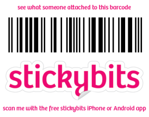
Stickybit # 6925359849840, better known as "Jason Rushin's resume."

Stickybits was a big hit at this year’s SXSW and has gotten wide coverage from CNET, ReadWriteWeb and others, but the general vibe seems to be, “What will people do with this?”  And therein lies the crux of Stickybits’ challenge:  there are some great ideas beginning to surface, but the execution is still a few versions from solid.

Marketing with Stickybits

For B2B marketing, I immediately thought that this would be a great solution for trade shows and events, where fewer and fewer attendees actually want to add another set of vendor collateral to their already schwag-heavy logo’d backpack.  More often than not, I’m hearing booth visitors ask, “Can you just email me something?”

Now, if we had a big Stickybits barcode that they could just scan and have it pop-up a YouTube video of a product demonstration or PDF collateral or link to our website, that would rock.  But since the barcodes only work with the Stickybits app, the scenario would likely play out like this:

  1. Convince a stranger to add this new Stickybits app to their phone – an app that your company didn’t create and that is essentially bloatware as far as the stranger is concerned.
  2. Wait while they downloaded and installed it, hoping that the connection in the event hall was strong enough for a speedy download.
  3. Explain to them how to use the app, and essentially become a salesperson for Stickybits for a few minutes.
  4. Finally, walk them through getting a snapshot of the barcode quickly, and then explain how they can access your marketing materials within Stickybits.

Let’s assume that you could get past these initial steps, maybe make it fun for people to download the app and not take more than a few minutes of their precious time.  This is where Stickybits really falls down from a usage perspective:  the “bits,” as they refer to the notes attached to a barcode, don’t really pop anything up.  The app just lists the links as text, requiring the user to scroll through and click on the link they want to see.  While this isn’t that big of a deal, it is another step and does dramatically limit the “awesome” factor of the experience.  The bits are formatted much like comments to a blog, so there’s not really any formatting or categorization.  And currently, anyone can attach new bits to the barcode, which totally limits, if not outright eliminates, its usage for corporate marketing.  (Imagine a competitor scanning your barcode then adding their collateral as well…or something worse.  Yes, as the barcode owner, you can delete bits, but you need to do it proactively.)  The final drawback in this scenario is that your links appear on your prospect’s phone, with no obvious way to forward them to an email address for viewing on a bigger screen, passing on to colleagues, or printing.

Stickybits allows you to download a jpg of your barcodes for printing or pasting elsewhere, or you can purchase these pre-printed vinyl stickers directly from Amazon.com(Credit: Amazon.com)

A major hurdle here is the need for the Stickybits app specifically, not just any barcode scanning app.  On my Android phone, I now have four barcode scanning apps, including Stickybits.  Yes, that’s probably a bit excessive but I’m assuming that a good number of people already have at least one, and it would be nice to facilitate that whole process by eliminating the need to download another app just for this one-time scan.  But then again, that’s how Stickybits will become pervasive.

Huge Potential

Despite these drawbacks, the potential here is enormous. Adding a barcode to collateral that drives prospects to a microsite, a special promotion, or a related video would be useful.  A barcode on your event schwag would turn your stress ball into an instant, persistent data sheet.  Barcodes on event badges would be a great idea too, letting attendees scan each other for business card information and whatever else each attendee wanted to attach to their badge.

In addition to corporate marketing, it would be great for a museum to add additional content to each exhibited item, or for a tourism bureau to add backgrounds, photos, and maps to a point-of-interest (wouldn’t it be great to know the details behind a historic building as you snapped the Stickybit attached to the cornerstone plaque?).  It would also be neat as the basis for a self-guided tour, where each barcode gives you info on your current location as well as directions to your next stop on the tour.  Think of the cool tie-ins with augmented reality apps showing what’s around you or what used to be there (say you’re standing at San Francisco’s city hall and you could see photos from the aftermath of the 1906 earthquake).  There could even be links to relevant maps, audio, video, and upcoming events.

My Two Cents on Stickybits

The challenge that I had, and that I’m sure a lot of visitors to stickybits.com have is, “What do I do with it?”  Yes, there are some initial ideas, like the business card or the greeting card, but the execution does not yet live up to the promise.  Reading their forums, it looks like a lot of my concerns are shared by others, and that Stickybits is taking note and promising to address some of them.

In the meantime, I’ll be using the few barcodes that I’ve downloaded, and I’ll be keeping an eye on the Stickybits solution as they advance the capabilities.  It truly does have a ton of potential, and I can’t wait for their next few iterations to add things like branding (which they already allow for product UPC codes), more interactive bits with embedded videos and document viewers, and hopefully the ability to scan Stickybits’ barcodes with other scanning apps.

As an aside, Stickybits’ has an opportunity to improve their website navigation and really get people excited much more quickly.  It took me a lot of random clicking to figure out how to get off of their homepage, but once beyond that, the sidebar menu was very intuitive.  I’m assuming that the average prospect will be unsure how or why to use Stickybits initially, and their website doesn’t do much to help ease the process or make it seem obvious.  I would bring the “few examples” above the fold, or better yet, incorporate those into the three steps in the thought bubble.  I would also bring their site navigation out to the homepage.  Yes, I’m sure they purposely limit the links to ones that prompt visitors to download their app – more downloads equal more potential users – but even that’s not intuitive (you have to click on the “Get the app” guy).

Bottom line:  it’s a killer idea that’s just about six months away from being a killer marketing solution.