Google Finally Markets to the Masses

A few months ago I wrote a post about Google’s lack of mass-marketing prowess.  Just the look and feel of most of their products has that “built by engineers, for engineers” vibe.  Android is a great example, even with the advances in Honeycomb.  Same with Gmail, Google Analytics, Google Docs, and on and on.  Now don’t get me wrong: I love Google products.  I’m an Android nut and I’ve totally given my digital life over to Google’s cloud services. I live in Chrome across multiple devices and I love it (for the most part).  But even the new Chromebooks, which I think are killer products (I love my Cr-48), are getting trashed by both mainstream and techie reviewers (I’ll skip the rant on their obvious Apple bias…).  I do have an engineering background, which maybe aligns my thought process and helps me “get it” with respect to their usability.  Sadly, however, nearly all of their products don’t pass the parent test:  Would my mother be able to use this?

And that’s all just related to using their products.  The marketing for their products and brand has been virtually non-existent.  While commercials and advertisements may be what you think of when I say “marketing,” I’m also talking about their product marketing:  colors, logos, designs, instructions, user guides, help pages, usability, screen flow and layout, etc.

But things seem to be taking a turn for the better.  The Cr-48 came in a neat package, with a clever design, but it still wasn’t mainstream.  Now, a few months later, Google seems to be jumping on the consumer marketing bandwagon. Maybe it’s the frequent slamming of the usability of their products, or maybe it’s their attempt at competing directly against Apple.  Whatever the reasons, I’m glad that they’ve finally hired some humans, at least in their marketing department.

Google Music android app image
The "old" Google Music app icon

Google’s new Music Beta product is a great example. (Although they need to stop beating the “beta” label, which I’d bet that 80% or more of consumers outside of the Bay Area have no clue as to what that means.)  Here’s the icon for Google’s old Android music app:  a simple, bland speaker. I know that it’s a speaker.  Most people would get that it’s a speaker.  Some may think that it’s a wheel, but it’s probably obvious that it’s a speaker, right?

Below is Google’s new music app icon and the imagery from the product’s landing page.

Look at the colors!  Look at the clear meaning of the icon – headphones!  Look at the background!  Wow, now there’s some consumer marketing by someone who knows consumer marketing.  Finally!

Google Music android app image

Another great example is Google’s ad for the “It Gets Better” Project.  Just their simple participation in such a wonderful and progressive movement is fantastic.  Honestly, I challenge anyone to watch the Google Chrome ad for this project and not come away moved by it’s message and the deeply personal stories and emotions conveyed by the people in the video.

Google Music Beta landing page imageBottom Line

As a geek and gadget nut, I’m looking forward to my next Android phone and maybe even a Honeycomb tablet.  But, as a marketer, I’m glad that Google is finally getting their act together and focusing on the average consumer, not just the tech, geek, engineer.  To compete against Apple’s amazing products and incredible marketing machine will take more than Google Labs and highly-innovative but complex features.  I just hope that these few examples are the beginning of a new page for Google, not just random one-offs.

In the meantime, Google, how about creating a “movie beta” and allowing me to purchase and download movies to my phone?  Apple’s been doing that for years…

Devinsupertramp’s Awesome Self-Promotion

I recently stumbled across the YouTube page for devinsupertramp and was struck by his very well-executed self-promotion and marketing – all without being hokey or narcissistic.  He has done a great job at creating a fun, interesting brand, putting his colorful video imagery at the forefront of the experience, and building a great relationship with fans.

First, let me tell you how I found this guy’s site.  Better yet, here’s the video that I saw (on Guy Kawasaki’s never-ending Alltop.com stream) marketing a neat jet pack from Jetlev – you gotta watch it! Seriously!

The quality, editing, soundtrack, and overall fun “vibe” of that video just blew me away – so much so that I’m now saving up the $99,500 to buy one of those for myself! 😉

I was also intrigued enough to check out the person who created the video, devinsupertramp.  What’s great is that his YouTube page is nearly a full-fledged website.  (Who knew that you could customize YouTube?  I guess, as a marketer, I should have known that…)  But just the feel of his site, colorful and fun, with a black background to focus the visitor’s attention on the images.  Plus, the funny face he’s making in his “portrait” speaks volumes:  he’s poking a little fun at himself which shows that he doesn’t take himself too seriously, but the photo gives the audience a good enough picture that he would be easy to recognize if you saw him.

Marketing, however, is only half of his story.  If the product didn’t measure up, the marketing would fall flat.  I’ll let you visit his page and watch the videos for yourself (definitely amp them up to HD quality!), but I have to say that they are incredible!  Again, a very fun vibe, and always with a warm, “bunch of friends” feeling to the cast of characters.  And the music choices are fantastic – fitting perfectly with each video’s feel.  I even downloaded the tune from The Beatards featured in the Jetlev video.

He puts a new video up every other Tuesday, and today’s Tahiti video is another great one, and has an original score to back it up.  Hit up his page to watch the video, or just check out his excerpt photos here.  Amazing images!

All of his videos are extremely well done, but if you only have a few minutes (after watching the Jetlev video, of course), be sure to also watch Waimea cliff jump, North Shore in Slow Motion, and the appropriately-named Huge Bike Jump into a Pond 35 feet in the air.

Bottom Line

The marketing around this “brand” is nearly perfect.  It has a feel, a personality, great interaction with fans, and a killer product to back it up.

Did I use the word “awesome” yet?  😉

You can follow devinsupertramp on Twitter or Facebook.

Is Today’s Honolulu Groupon Misleading?

I’ve been hearing and reading a lot of mixed reviews from merchants and small businesses on the “daily deal” phenomenon.  There’s been a few nightmare stories, as well as research from Rice University’s b-school showing that Groupon promotions were profitable for only two-thirds of businesses, and 40% indicated that they would not run a “daily deal” promo again.  I’ve also read that, in order to be profitable for the merchant, daily deal redeemers must visit at least four times.

The arch nemesis of the F-U Penguin, I suppose...

On the positive side, I’ve recently spoken with a few local merchants who think that the daily deal sites are amazing marketing tools, even for the unlikely-to-repeat tourism market. One tour boat operator mentioned that, “If my boat was filled entirely with customers who redeemed a Groupon, I’d still make money.”  Another, discussing today’s Groupon (April 19, 2011) for a local resort, remarked that “They’ve sold over 200 room nights already!  I’d say that’s successful. There’s no way they could have done that in one day without Groupon.”

While I’m not going to get into the profitability of running a daily deal, I did start to look at the “fine print” around today’s Groupon and found some interesting murkiness…

  • The deal states a value of $345, but looking at the hotel’s website, the most expensive two-bedroom suite (as offered) is only $295. And that’s the “high season” rate. Did Groupon inflate the rack rate of the offer to make the discount look bigger?  It’s not clear, but the Groupon rep commented that a $20/night parking fee is included and makes up the difference (but, as I learned in “The Social Network,” checking the math shows that adding up to only $315…).
  • Groupon states a limit of two per visit in the fine print, but the deal’s details state, “You may purchase up to three Groupons in total and combine them for a three-day stay at almost any time over the next year…” Probably just a typo, but you’d think Groupon would be experienced enough to ensure these fundamental errors wouldn’t happen.  The entire deal is only 280 words, so not a monumental editing effort.
  • In the comments, there are a few that warn buyers of a three-night minimum stay requirement. The Groupon rep chimed in to blame the owners for omitting the minimum stay from the deal, then to tell everyone to call the merchant to get questions answered. He finally apologized and offered refunds – FIVE hours after his initial “Give me a few to sort all of it out” post.

While I won’t slam anyone over mistakes and typos – Buddah knows that I make more than my share – a few things are troubling about this specific post and the way that Groupon is handling it.

  • The deal has been in effect for over 18 hours, yet none of these major inconsistencies have been fixed on the deal page – the unclear $345 value, the lack of minimum stay requirement, and the mismatch between combining two or three coupons – all of these “errors” remain.
  • The Groupon rep jumping to blame the merchant almost immediately.  That’s horrible service on Groupon’s side, and I would be fuming over that if I were the merchant (even if I did purposely omit that detail).
  • The Groupon rep telling people to call the merchant to answer any questions.  OK, I see many things wrong with this approach, #1 being the ability for the merchant to even handle the onslaught of calls without prompting. A merchant I spoke with last week said that, on the day he ran his Groupon, his “bluetooth earpiece practically melted!”  Of course, he liked the call volume.  But proactively prompting buyers to call with questions?  I can’t imagine what the poor people at the resort were doing.  I purchased a daily deal a few months back for a spa, and when I called the next day to book an appointment, the receptionist asked me to call back in a few days since they were so inundated with a massive volume of callers.
  • The apparent lack of Groupon “corporate” support for the field rep.  I don’t know how Groupon runs the logistics of a deal, but it appears as though the Groupon rep is all alone to manage the deals as they are in-process.  Where’s the support staff to actually run the deal, work with the merchant during this busy 24-hour cycle, and answer buyer questions while the rep is out selling?
  • The rep’s lack of understanding of his client and their deal.  It appears as though he sold the deal to this merchant without even understanding the details of the specific deal.  Sure, he has to sell one per day (maybe more), and he’s probably selling weeks, if not months, ahead.  But, shouldn’t he spend part of each day ensuring that tomorrow’s deal will go off without a hitch?  Shouldn’t he be more closely managing his clients to ensure that their specific deals are bulletproof?  Doesn’t Groupon have enough experience at this point?  And what about the merchant?  This is probably a major marketing effort for them, probably bigger than they’ve ever done before.  Does this rep expect (or care) to have them run another deal in the future?

I hope that this isn’t indicative of Groupon’s standard operating procedure with respect to deal fine print, error fixing, and customer service.  It would be disappointing if they were being purposefully misleading in order to drive revenues…

Screw the VCs, I Know JQuery!

When I first set out to start my own app business, I figured it would require a few basic things:  a business plan, developers, an alpha version, and then lots of angel and/or VC money to make it all come together.  But, this week has really made me realize that I was very wrong.  Let’s take a look the “why” for each area.

  1. Biz plan:  In my years in the Bay Area, I’ve come to be highly suspect of any business plan, especially the revenue projections.  Moving to Hawaii and working with some non-Bay Area companies has only reinforced my belief that business plans are akin to resumes for businesses: slightly inflated at best, outright lies and fabrications at worst.  Business plan financials are notoriously inflated, because unless they show a billion-dollar market opportunity, they are worthless to VCs.  So, every business plan creator then fabricates that billion-dollar opportunity out of thin air (and Gartner reports).  It’s one of the many dirty little secrets of startups: everyone knows that it’s a lie, but everyone just goes along with it.  (In place of a biz plan, I created a simple, three-page “concept document” to pass around for feedback.)

    Swimming In The iPool (cc JD Hancock)
    Swimming In The iPool (cc JD Hancock)
  2. Developers:  I wish that I could code.  I wish that I could create some whiz-bang app that used your GPS coordinates to tell you the optimal inflation for your mountain bike tires, or could use a photo from my phone to tell me if that slice of bread is bad before I make toast with it.  I wish that I could take all of my ideas for the next killer app and make it a reality that same evening.  Sadly, I’m limited to Google’s App Inventor (yes, I’ve already created my very own “whack-a-mole” app), WordPress (you’re looking at it right now – and you’ll see a different version if you visit this page with your mobile phone), and have just been introduced to Jquery Mobile.  What does that mean?  Well, the combination of these three (plus others, like Mobile Roadie and this list), make it easy for anyone with some basic knowledge of code to create at least a nice alpha version of any mobile app and at best a fully functional product.
  3. Alpha Version:  Ah, the all-important alpha version: creationism.  Sure, it might not actually process credit card payments or use the stars for navigation, but it will give you the ability to give a great demo and introduce your app concept to friends, partners, and potential users/customers.  Using Jquery, it took me about one day to create my first mobile web app – mostly functional!  I made a “Call Now” button fire off the phone’s dialer.  I used coordinates to create a “Map It” button that opens Google Maps’ navigation tool.  And, it all looks pretty darn nice, if I must say.  That’s amazing, and significantly delayed my need to pay real money to real developers.  Sure, I’ll need great developers very soon, but it’s amazing what can be accomplished easily and free these days.
  4. VC mondy:  How much have I spent so far?  Well, not counting my own time and Starbucks purchases, I’ve pretty much spent zero dollars and have a “real” version of my concept app that I can show to everyone.  It doesn’t cover the full breadth of my concept, but it gets the point across and does it much better than me saying, over and over, “Imagine if you had this on your mobile phone…”  Now, I can show them what I mean, and get exponentially more valuable feedback, ideas, and direction.

So, why do I even need VC money?  Last fall, I watched this video by Jason Fried.  One of his points that resonated with me was around taking outside investment:  once you take that money, you’re focused on spending it, not on actually making money.  It was a great point, and I’ve seen that happen countless times in Bay Area startups.  Get $X million, spend it like you’re already making millions in revenue, then scramble for your next round of funding when you realize that you aren’t pulling in the revenue for which you set expectations in your business plan (see #1 above).  I also recently met with a friend who has had success in numerous startups, large and small.  When I mentioned looking for some angel funding, he was almost offended.  Why would I want that false sense of security, he asked.  Why would I plow money into development, or marketing, that wouldn’t be sustainable after the money ran out?  Why would I take seed money at a fictitious valuation, which then requires a valuation increase for Series A, which then requires an inflated valuation for Series B, and so on?  Why would I want to dilute my potential?  (Of course, I can see many reasons to actually take outside investment, like the expertise provided by the advisors, to enter new markets, or to expand a proven model.)

Bottom Line

In the few short weeks that I’ve been at this, I’ve talked with a bunch of developers (CA, HI, Mexico, and India), a few VCs, and a ton of friends and colleagues.  While 100% of the feedback has been valuable, only about half of it has been positive.  In most cases, I tend to agree when they point out flaws, challenges, and competing products.  It helps me to hone my pitch and focus my concept.  It makes me better at what I’m doing, gives me a thousand more ideas, and helps me to really figure out how to make this work.

Yeah, I’ll probably need VC money to make this work.  But, I’ll never get tired of reading the stories about successful entrepreneurs recounting the dozens and dozens of people who told them, “That’ll never work.”  On the VC side, I just hope I don’t have to plow through 298 more rejections before I reach the level of Pandora…

Channeling the Positive…

So often, I tend to get very negative when it comes to marketing or business ideas.  I’m sure my DW can attest to my most-used comment (“outburst” is probably a better word…) while reading VentureBeat is, “Oh my god! Listen to this stupid idea that just got millions in VC funding!”  I’m not sure if it’s age, cynicism, or just being around a critical mass of coworkers over my lifetime to really, finally be able to quickly separate the smart from the, well, not so smart.

Example:  While reading about Bump.com, the license-plate social media startup that links people via their car’s license plate numbers and has just raised $1M, I jumped to the conclusion that it was, yet again, another reason that the Silicon Valley bubble was about to burst.  Instead, I should have focused on the positives:

Great Startup Ideas
By cswtwo (via Flickr, Creative Commons)
  • VC and angel money is fairly easy to get.
  • A startup’s focus is usually very different after a year.
  • Getting an early jump on connecting your car to your social graph is an ingenious idea.
  • This is a great experiment to test the bounds of social media.
  • I now have an outlet beyond my middle finger and my horn for the jerk-store in front of me who jammed on his breaks and didn’t use his turn signal.

With less than two weeks focused on my own startup, I’ve quickly realized that there is as much negative energy in the business world as there is positive.  And, being pretty much a solo operation, it’s up to me alone (and maybe Buddha) to ease my suffering.  My negative energy hasn’t been because these other startup ideas have been that bad (OK, some have been that bad…), it’s been due to my jealousy and anger at myself for not having the confidence and positivity to launch something on my own.

Bottom Line

Now, when my startup launches, I can’t wait for all of the other people to say, “Yeesh, what a stupid idea!”  It’s already happening, and, after a momentary, “oh no, they might be right,” I quickly plow forward, knowing that this is a great idea!  And, to all of those other companies getting seed or VC funding, I say, “Good for you! (But leave some for me!)”

On My Own: Starting Something Big

Well, today is my first day as a full-time employee of my own company!  Sure, I have no salary, no funding, no infrastructure, no office, and am incredibly anxious, but at least I’m doing it!

It’s been something I’ve wanted to do for years, and finally, I’m going all in.  This past Friday was my last day at my previous (and hopefully final) consulting gig, and now the only boss is ME – and my wife… 😉

GapingVoid.com
Cartoon by Hugh (c) gapingvoid.com

With companies like Groupon, LivingSocial, Gilt Groupe, Zynga and others raising hundreds of millions of dollars at valuations in the billions of dollars, I became increasingly inspired.  With copycat companies and silly ideas like a license-plate social network raising millions, I became increasingly frustrated: If these marginal ideas can get off the ground, just think of how a GREAT idea would do!

So, after MUCH encouragement and prodding from my lovely, supportive wife, a lot of “that’s a great idea” from friends, and sideline co-founder support from buddy, I’m going all-in and starting my own business! Today, Monday, March 7, 2011, is day one!

I’d love to tell you all about right here, but I’ve always been jealous of the secrecy surrounding those so-called “stealth” start-ups.  (I mean, really, why can’t I know?  Why am I not allowed in your group?  Is this junior high?)  So, for a little while, it’ll be stealth – at least until we find a name for it…

Know When It's Time To Leave
Know When It's Time To Leave (c) odeisel

What I can tell you is that it’s going to be an app-based business – and let me coin that phrase right here, right now.  It’s like an online or e-commerce business, but the “online” component will be replaced by mobile apps.  So, while you may think of it as just a mobile app, it’s not.  It’s a business that’s facilitated by mobile apps.  Sure, there will be a web component, but only for support and data entry and complex activities.  The key to the idea is marketing, and that’s what I love. There’s a marketing challenge, and hopefully, this is the solution.

I can also tell you that the idea sprouted about a year ago, but has really taken hold since we’ve moved to Hawaii, where the $12 billion tourism industry is about 25% of the total economy. This is a great year to start a tourism-related business in Hawaii, since visitor spending is already up 20% this year after the worst drop in economic activity since Hawaii became a state.  I’d love to tell you more, but my boss is a real jerk and I must get back to work…

Stay tuned, and hopefully this is the start of something BIG!

Marketing “The Eddie” Even When It Doesn’t Happen

Quiksilver is a great marketer, but it’s really great marketing when they can take advantage of a non-event. The Quiksilver in Memory of Eddie Aikau, known as “The Eddie,” is a big wave surfing event named for famed Waimea Bay lifeguard and surfer, Eddie Aikau. The tournament is held within the December to February waiting period, but is only “called” when waves reach 20′ in height.  The excitement usually begins when forecasters predict a large, approaching swell and the contest organizers start setting up. Waves of that size are rare, however:  since 1984, the event has only occurred eight times.

What Quiksilver has managed to do, brilliantly, is keep the buzz alive every year with subtle marketing and the frequently-seen “EDDIE WOULD GO” bumper stickers and t-shirts.  And, while the event isn’t in the mainstream culture, within the surfing world, it’s huge.

Building the Buzz

This year, the buzz began a week or so ago with news of an approaching swell and contest preparations getting underway.  With excitement all around, and a sizable swell approaching, the contest was called for January 20th, driving spectators in droves to line Waimea Bay at 6am to watch riders surf waves four or more times their own height.

Unfortunately, The Eddie organizers are sticklers and while the waves did hit 23′ at times, the 20-foot-plus waves were too inconsistent.  But, as the video below shows, the hype created and the marketing value just in the potential of the contest is huge. (And the waves are still pretty freakin’ big!)

Luckily, there are still five or six weeks of waiting period left in the window, so The Eddie still may happen this year.  Let’s hope that it’s on a weekend so more of us working stiffs can watch, in awe, those brave enough to honor the memory of Eddie Aikau by launching themselves down a 25′ wall of fast-moving ocean!

Bottom Line

Quiksilver has created a lifestyle brand, where the product is secondary to the lifestyle that they support. Marketing that lifestyle, that vibe, that culture, is what gives Quiksilver the ability to so successfully promote and benefit from an event that doesn’t even happen.

Agree? Disagree?  Let me know your thoughts.

Pricing a Cloud-based Application

I recently had the opportunity to consult with a local startup around their plans for pricing their cloud-based home health monitoring application.  They have an amazing product and great early traction with beta customers, and are now at the point of thinking about pricing as they sell direct and through partners, adding two dimensions to their pricing equation.  Adding another dimension is their incorporation of add-on services, and how to pass along those fees while also adding a markup – for both themselves and their partners.

70's Kmart Pricing by Roadsidepictures (via Flickr CC)

As is usually the case, once they started thinking about their pricing strategy and all of the associated touchpoints, the problem quickly expanded beyond “what do we charge the customer?” to “wow, there’s a lot we didn’t consider!”

Who’s Important? The Customer!

There are a few ways to go about pricing for a cloud-based app, but generally it’s about getting down to the perceived value and making the pricing model match your customers’ or partners’ mindset.  If you try to price based on your needs or benefit, you might end up confusing the customers.  If they match, that’s rare but fantastic.  Always remember that your customers will evaluate your pricing based upon their perspective, not yours.

It’s also important to understand what your customers are using for their perceived model when evaluating your pricing.  If you’re selling cars, they expect to see a sticker price and to pay much less than the number they see.  If you’re selling mobile apps, they expect it to either be free or close to 99 cents, and they further expect updates to occur frequently.  Why?  Because that’s how mobile apps are generally offered, and that has become the accepted “model.”

Consider the typical legacy pricing model of days gone by, where you paid a large, up-front fee for the software and any required hardware, then paid additional fees based on number of locations or users.  There may even have been recurring fees for add-on services.  This model was mostly in favor of the seller, but became the de facto pricing model for both consumer and enterprise software applications.

Enter “the cloud,” where hardware fees disappear and the service becomes more akin to a utility than a product, and where the SaaS trailblazers, like Salesforce.com, set the stage for per-user and ala carte functionality-based subscription pricing.  For better or worse, this is now the standard model for pricing cloud-based applications, either enterprise or consumer.  It’s not a product, it’s a service.  And, it’s not an outright purchase, it’s a recurring utility where I pay for what I use and can turn it off when I no longer need it. Furthermore, especially on the consumer side, people are becoming more and more comfortable with subscription pricing for apps like cloud-based backup, photo storage services, VoIP, and others.

Bottom Line

The greatest area where the cloud has turned software pricing on its head is transparency.  Skype, Salesforce.com, GoToMeeting, Mozy and other sites tell you up front exactly what their services cost.  There’s no dickering, no slimy negotiations with tacky sales reps, and no queasy feeling after you commit that you’ve somehow paid more than the next person. If there’s anything to take away, it’s that your pricing should be front and center on your website!  Tell everyone what they get, why it’s amazing, and how much it will cost.  Add a few tiers to make it easier to understand.

So what’s the bottom line here?  I’m not sure.  I know that I want software and apps to be priced based on my perception of value, and that I’m willing to pay a fair price. I naively assume that most people think the same way.  I’m willing to pay a subscription for something that I use on a regular basis, but I’m also willing to accept less usability for a lower price (or better yet, free).  In the end, I just want a good product at a fair price.  Is that too much to ask? 😉

What do you think?

Marketing with Sound

I just love the way that Skype has used original and distinctive audio sounds as such a major part of their branding.  The startup “aaaaaahhh – POP” is happy, fun, and unique.  Even their shutdown sound is nice.  (Although, not everything thinks so. A Google search on “skype startup sound” shows that there are plenty of haters out there, including this doozy:  How to Kill Off and Murder Skype Startup Sounds.)

By B.Romain. Used under Creative Commons.

The Skype sounds remind me of the “Nokia tune” from a few years back, which they used in commercials and was the default ringtone on Nokia devices.  It was actually funny to see multiple people reaching for their phones when that sound was heard!  On the other hand, maybe it was sad to see how many people couldn’t figure out how to change their ringtone…

Skype’s audio branding also reminds me of the Yahoo! yodel, Metro PCS’ “Hello, hello, hello,” and even AOL’s “You’ve Got Mail.”

In today’s electronics-driven world, it is just now striking me as odd not to hear a sound when I start up my phone or open an app.  I hear a recognizable tune when I boot Windows, or OS X, or even Ubuntu (best OS boot sound of the three, IMHO!), but not when I start my iPod Touch or my Android phone.  Sure, my Nexus One phone rocks a cool video during boot-up, but no sound (OK, it vibrates for a split second, but that’s not good enough). And it’s whole purpose is based on sound – it’s a phone!  Apple has even less of an excuse, given their focus on music.

So what is the marketing takeaway here?

Almost every computer, laptop, and mobile device has the ability to play sound, and most devices are good at it because they have a speaker phone built right in (or better yet, surround sound!).  Websites, apps, and logos take advantage of colors and animations, so why not sound?  It can be used as a trigger, like your sense of smell makes you think of Granny when you smell baking bread.

When I build my own app, you can be sure that it’ll have a start-up sound.  Of course, it’ll probably be a Pearl Jam song…

For those considering it, just a note of caution: not everyone wants to hear a yodel when they open your app in the middle of a meeting, so make it optional or make “off” the default sound…

Why Do Marketers Make it So Difficult to Unsubscribe?

Over the last few months, part of my daily work routine has been deleting the dozens of spam and marketing emails that I receive every night.  And, without fail, I always think, “Gee, maybe someday I should just unsubscribe from all of these lists!”  I’ll skip over the ironic, hypocritical nature of that statement being uttered by a marketer…

unsubscribe
By johnscotthaydon via Flickr. Used under Creative Commons.

Nevertheless, I chose yesterday as the beginning of the end of my overloaded inbox!  As I started, I took both a marketer’s view and a recipient’s view of the unsubscribe process.  Given that I ran a recent campaign designed to get people to proactively unsubscribe, where we almost begged them to remove themselves from our list, I started to laugh at the methods at which recognizable and established publications and companies use to make the process so confusing.

Click Here to Select Your Unsubscribe Process

At the highest level, there seems to be four general methods that marketers subscribe to (hee hee) for their unsubscribe process, from easiest to most absurd:

  1. The one-click method:  A link labeled “unsubscribe” that opens a webpage stating that, “You’ve been unsubscribed.”  Done!
  2. The “You figure it out” method: A link labeled “unsubscribe” or “opt-out” or, the clearly designed to confuse “change your email preferences,” which then takes you to a webpage with multiple choices and unclear directions.
  3. The attempt to confuse people into giving up method:  A confusing link that drives you to a webpage where you need to reenter your email address, de-select the name of the newsletter you just clicked through, and select from a confusing set of action buttons with double-negative descriptions. Oh yeah, and then click “submit.”
  4. The “no method at all” method:  The favorite of the “grey market” list brokers and cheapo sales and marketing people who blast out thousands of messages that look like personal emails, hoping that someone will bite.

Having been in the software space for over a decade, an area of confusion for me is the time until the unsubscribe takes effect.  Across 30 or so unsubscribes in the past few days, I’ve seen everything from the instantaneous “you are now unsubscribed” to the ludicrous “please allow up to four weeks for this change to take effect.”  Really?  A whole month?  I can see where maybe some ’90s vintage, homegrown email system requires a manual upload of an unsubscribe list from one system to another, but a whole month?  If it takes longer than 24 hours for your unsubscribes to merge with your email marketing system, you either need to start calling the ExactTargets and Eloquas of the world, or you need to open your employer-provided MS Word ’95 and start cranking out a new resume.

Examples

Let’s take a look at a few of the unsubscribe procedures I went through over the past few days.

The Good

  • LeadSloth, using Vertical Response and the “one-click” method.  In fact, Vertical Response goes so far as to include this fine print on their unsubscribe page:  iBuilder users are strictly prohibited from using UCE (spam) in their marketing efforts, and are subject to immediate termination if they do so. Wow!  (BTW, I added the link to “UCE.”)

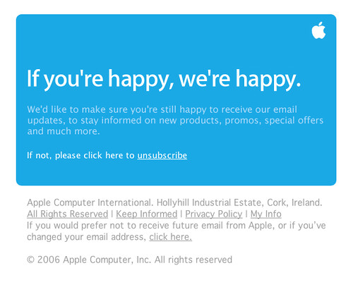
    A surprisingly friendly email from Apple.
  • While most unsubscribe pages were bland, flat, text-only affairs with little or no branding, Adobe/Omniture provided the prettiest unsubscribe page and actually put some thought into their branding during this seemingly negative activity.  With a focus on marketing and the customer, they are doing this the right way.

The Bad

  • TechTarget not only adds a bit of confusion, but questions my judgement by requiring a double answer.  Their unsub page asks, “Are you sure you want to unsubscribe from this mailing from the sender?” and forces a yes or no radio button choice, plus requires you to click “Confirm” to make it so.  Why not just have yes and no buttons?  They add a slight bit of confusion with a footer that says, “To opt out of all future mailings from this sender click here.”  This then takes you to a second page titled “opt out” that asks the same question with respect to opting out, not unsubscribing: Are you sure you want to opt-out of all future mailings from the sender? Now I know that the difference is opting out of one list vs. all of their lists, but not sure if the average person would get this at first glance.
  • I’m not sure if this method is easier or more difficult than visiting a webpage, but a few of the emailers, like Toolbox.com, resorted to the old school method:  If you do not wish to receive updates from Toolbox.com, please reply to this message with UNSUBSCRIBE in the body of your reply. Simple, but requires typing…  😉
  • The Association of Strategic Marketing alerts you to a potential delay, but is nice enough to give you the reason: Email is prescheduled, so it may take up to one week before you stop receiving email. They also make it crystal clear what you need to do to unsubscribe:  Be sure to click on the unsubscribe link to successfully unsubscribe. Thanks for that…
  • One of the other ways pubs put the pressure on the user to unsubscribe is by making you do the work and enter your own email address on the unsub page (rather than having it pre-populate). Windows IT Pro was nice enough to give me a warning, however: To STOP receiving promotional e-mails from Windows IT Pro, please click here to opt-out. (Requires you to enter your own email address)
  • Finally, TRUSTe offered this very un-trustable unsub link in their email: One-Click Unsubscribe. I clicked that link with glee, knowing in my heart that such a trustingly-named company would never lie, and that this would truly be the nirvana of unsub processes.  But then I was required to commit to a several-click process to complete their one-click unsubscribe:
    • Please enter your email address and indicate your preferences – required field, not prepopulated
    • I’d like to unsubscribe from the following (check all that apply) – required, and with four potential choices and nothing pre-populated, leaving me to wonder which one brought me here
    • I’d like to unsubscribe from ALL email communications, with a yes/no radio button but not marked as required
    • The “confirm” button

By my count, that one-click unsubscribe required a minimum of five clicks…  Based on that, no, I do not trust you, TRUSTe.

unsubscribe
By Josh Liba vis Flickr. Used under Creative Commons.

As Bruce Banner Says: “Don’t make me angry. You wouldn’t like me when I’m angry.”

OK, so I’ll admit that this is a picky rant post (as are most of my posts).  But really, do marketers need to make it so difficult for people to unsubscribe from their lists?  You’ve already pissed them off to the point where they are taking time out of their busy day to proactively tell you to stop bothering them!  It is taking 10x – or more – time and effort to unsubscribe than to just delete your email or add you to their blocked/spam filter.

But, even knowing that they are miffed, you go the extra mile to frustrate them even more, hurting your brand, equating your logo with frustration, and alienating one more person.  Worse yet, you try to confuse them into staying on your list, make them work for it, and rarely give them to option to opt out of all future emails.  If I’m pissed off enough to unsubscribe, and then I get another, slightly different email from you tomorrow, what response and reaction do you think that is going to elicit?

Bottom Line

Make it easy, easy, easy for people to get off of your marketing list and out of your way.  You’ll be eliminating their frustration, eliminating wasted time by your sales reps even thinking about calling them, and reducing the chances of your domain being flagged as spam.

But that’s just my opinion.  What do you think?  Leave me a comment and share your view.